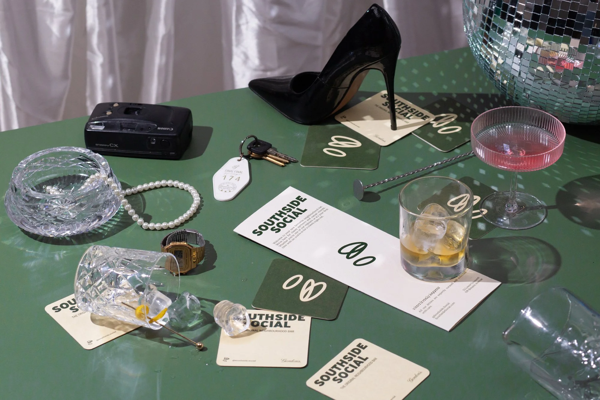
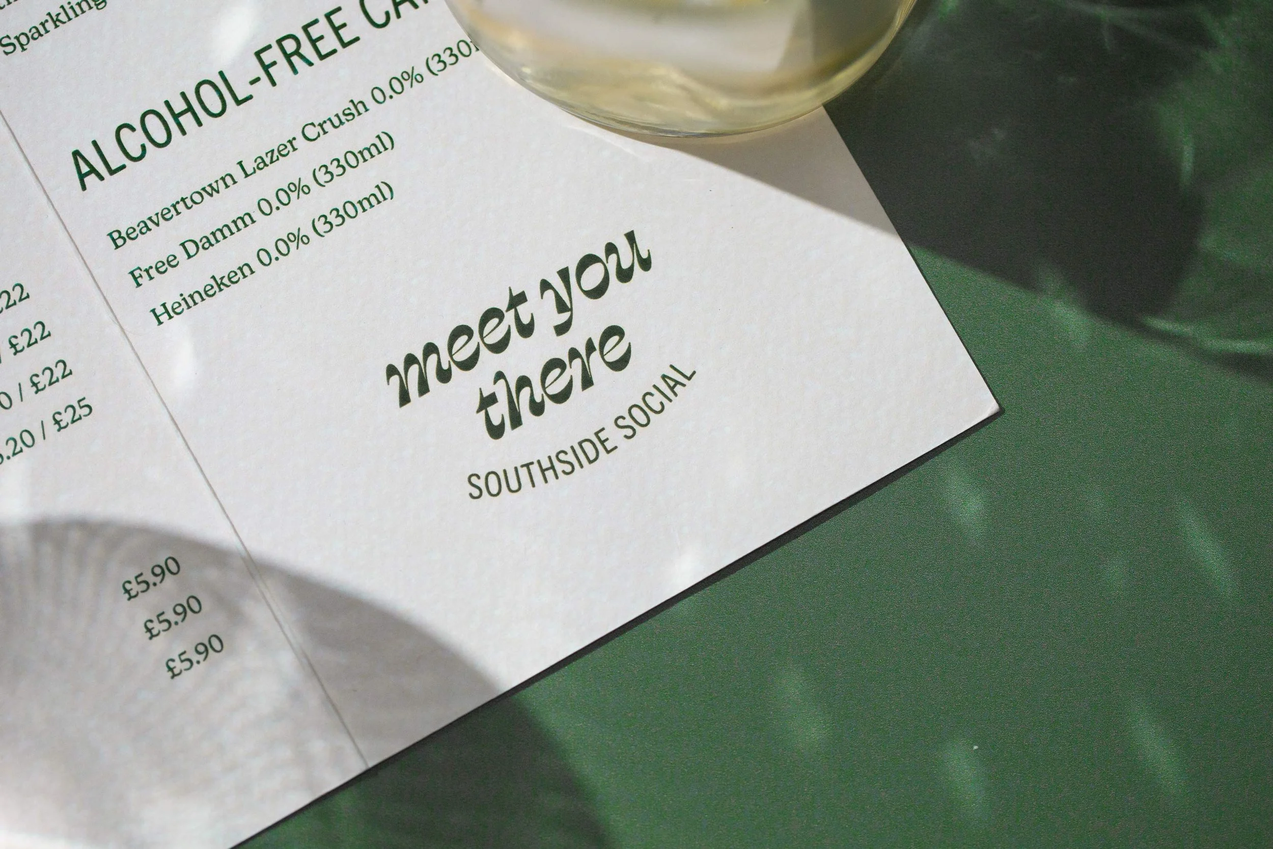
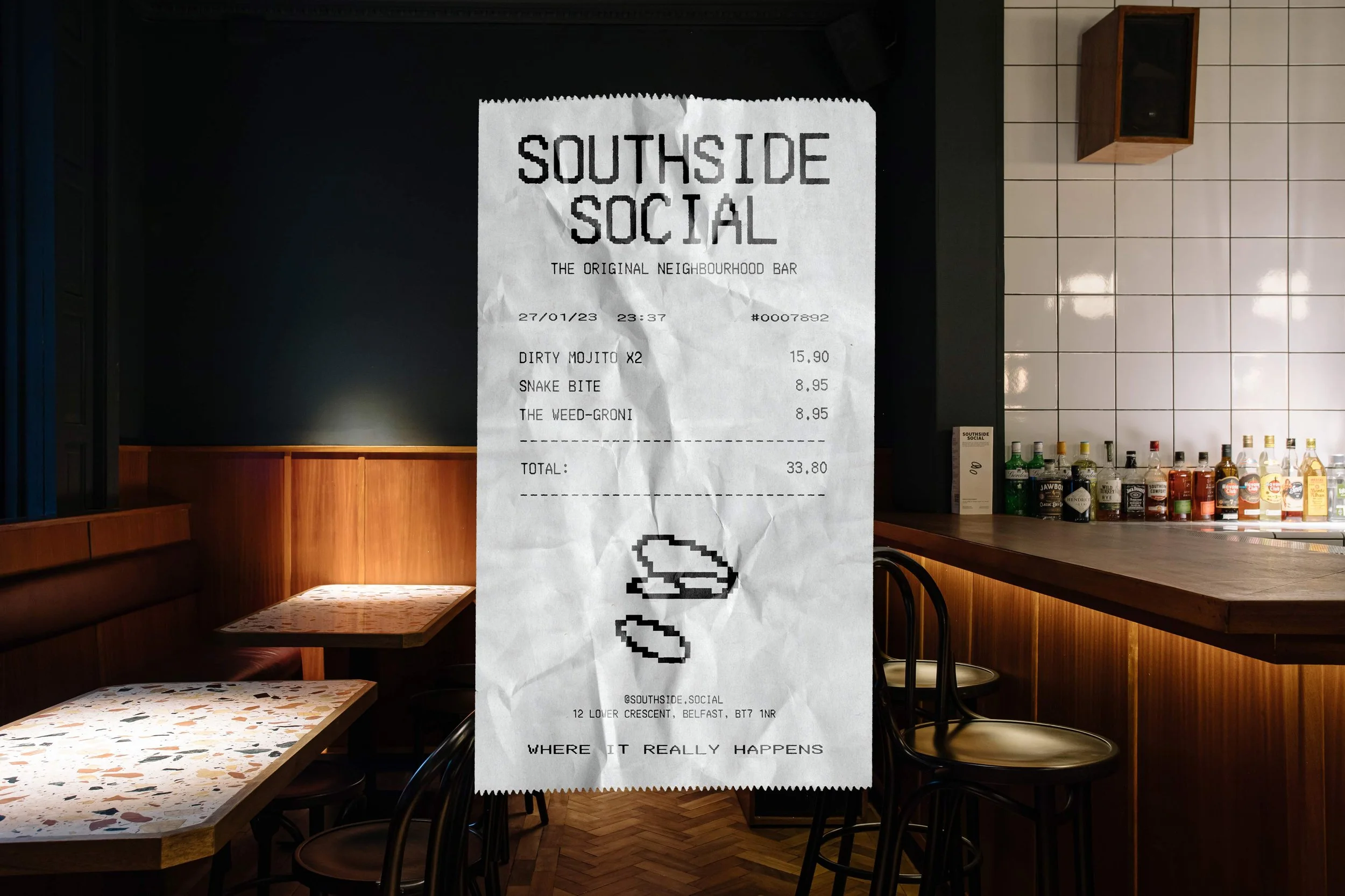
Southside Social, The Original Neighbourhood Bar. A testament to a good time, the logo represents the tipping of cups to cheers, speech bubbles of a bustling bar, and ’rounds’ among friends . The tri-story logomark brings the bar’s legacy of a “classic night out” into one balanced symbol. Looking to old sports clubs and retro lounge coasters for inspiration, the straightforward yet bold visual identity captures the bar’s timeless personality. Madmen-classy combined with 80s social club cheek were the early influences that would create the unique vibe for this end-to-end project including strategy, art direction, identity, language, copy, and rollout.
Identity Design


